August 28, 2024
We have a lot of dashboards at Spotify. Our Insight teams and analysts from across the company are constantly whipping up new dashboards for stakeholders and themselves, helping answer those big data-driven questions every day. These dashboards tackle everything from frequently used key metrics to exploratory insights and operational reports. It’s clear to us: dashboards help us move faster and stay data-informed.
In 2023, Spotifiers — mostly data scientists and the like — created more than 4,900 dashboards in Tableau or Looker Studio. These dashboards were used by more than 6,000 Spotifiers in 2023. There is no centralized team at Spotify solely in charge of creating dashboards, but rather a lively and free market of dashboards — with the Analytics Platform team providing the scaffolding for this market — consisting of dashboard producers and dashboard consumers.
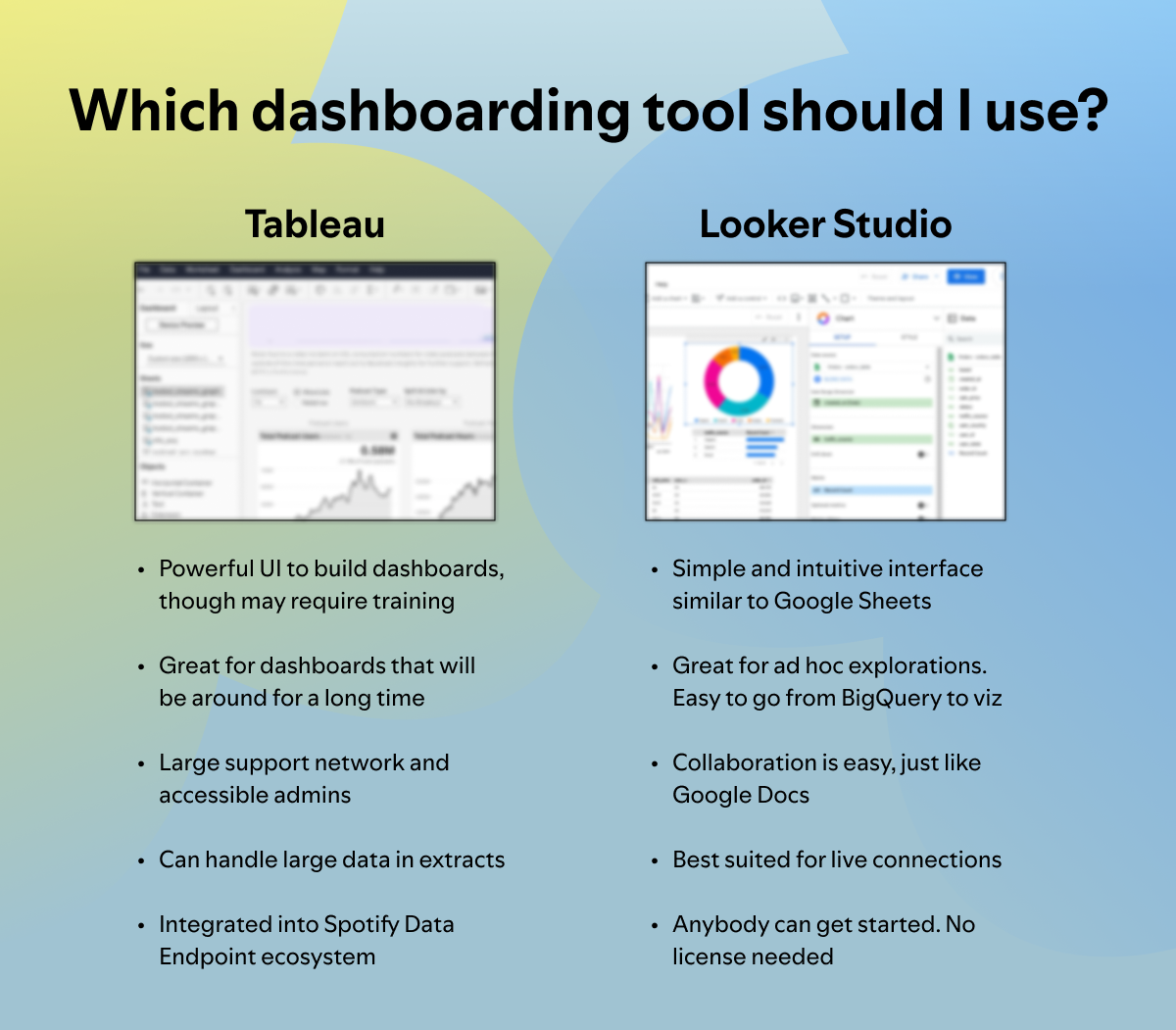
At the heart of our data visualization efforts, we lean on two main tools to amp up our dashboard game: Tableau and Google’s Looker Studio. With these in our toolbox, we’ve built additional systems and frameworks to maximize our ability to distribute, share, and discover insights like never before.
Let’s talk Tableau
Tableau’s advanced customization options let us create detailed, visually stunning dashboards that are not just informative but can also provide unique user experiences. We can craft a highly specific experience for every use case — whether that means unique drill-down capabilities or a custom chart type. These dashboards are often thought of as full-fledged internal products, not just data artifacts, each with a distinct user base with specific needs.
Next up: Looker Studio
Looker Studio, our quick and nimble sidekick, offers a seamless integration with Google products that we regularly use, like BigQuery. With Looker Studio, our users can go from SQL to chart to dashboard in a heartbeat. It’s particularly popular among our engineering and product teams for its easy, intuitive user experience.

Both Tableau and Looker Studio are essential to our strategy, each offering unique advantages. Looker Studio excels in rapid, easy-to-use visualizations, while Tableau provides complex and detailed dashboards for more nuanced needs. This dual-tool approach allows every Spotify employee to choose the solution that best fits their specific requirements, and we provide instructions for getting started with both tools through Golden Path exercises.
To ensure our most widely shared dashboards are appropriately and accurately interpreted — and then showcased across the organization — we develop them in line with specific standards and practices.
It starts with dashboard production. Building a dashboard, whether that is in Tableau or in Looker Studio, can involve a lot of moving parts. It requires specific skills in data visualization and storytelling — skills that require expertise and time that many of us may not have. On top of that, Spotifiers looking to build a dashboard are likely in different parts of the org and not always in communication or enforcing the same standards. To alleviate quality challenges with distributed dashboard design — at scale — we developed a Dashboard Quality Framework.
There are two parts to the Dashboard Quality Framework:
- Vital Signs: A set of automatic checks to ensure the dashboard is “alive and well.” These are enabled by the information we get from API and logs and include information on owner status, dashboard description, using LDAP groups for sharing, underlying data endpoint lifecycle, and whether updates and extract refreshes have been made recently.
- Spicy Dashboard Design Checklist: A checklist of data visualization and dashboard design best practices that could turn a vanilla report into a “spicy” dashboard. The checklist includes items related to visual design, usability, insights, and trust. This is a manual step that requires the human eye to determine. To enable this checklist at scale, we’ve turned this into a self-evaluating checklist that flags the dashboard when successfully completed.
Based on the results of these measurements, a dashboard then receives one of these quality labels:
- Low — fails Vital Signs (regardless of Spicy Design Checklist outcome)
- High — passes Vital Signs
- Golden — passes Vital Signs and Spicy Design Checklist
Ten percent of eligible dashboards at Spotify have achieved Golden status — and we strive to keep more than 80% of all dashboards at High or above, informing dashboard owners when their dashboards don’t meet the Quality Framework criteria.
Below you will find the exact details of this framework — stealing is encouraged!
To help our Tableau users, we’ve created a service that helps create and manage Tableau extracts. We’ve developed a SQL scheduling tool at Spotify that helps us schedule and run batch data workflows in Google BigQuery. We’ve enhanced this service to produce and publish Tableau .hyper files that can be used in dashboards on Tableau Cloud. These workflows run BigQuery SQL when upstream dependencies are available and are often faster, can load more data, and are more convenient to edit as the SQL is in .yaml files instead of embedded within Tableau.
And to truly drive home the idea that dashboards are a product, we equip all dashboard owners with statistics and insights about their own dashboards — showing number of active users, weekly retention, users by org or job family, and an ability to easily email users (think version updates or deprecation announcements). This also allows people to consider if they should market the dashboard to a new audience, or if they should deprecate them when usage is very low. It’s all about empowering dashboards owners to make great data-informed decisions about their data and dashboard products.

Insightful and beautiful dashboards aren’t any good locked away — they need to be accessible to interested stakeholders!
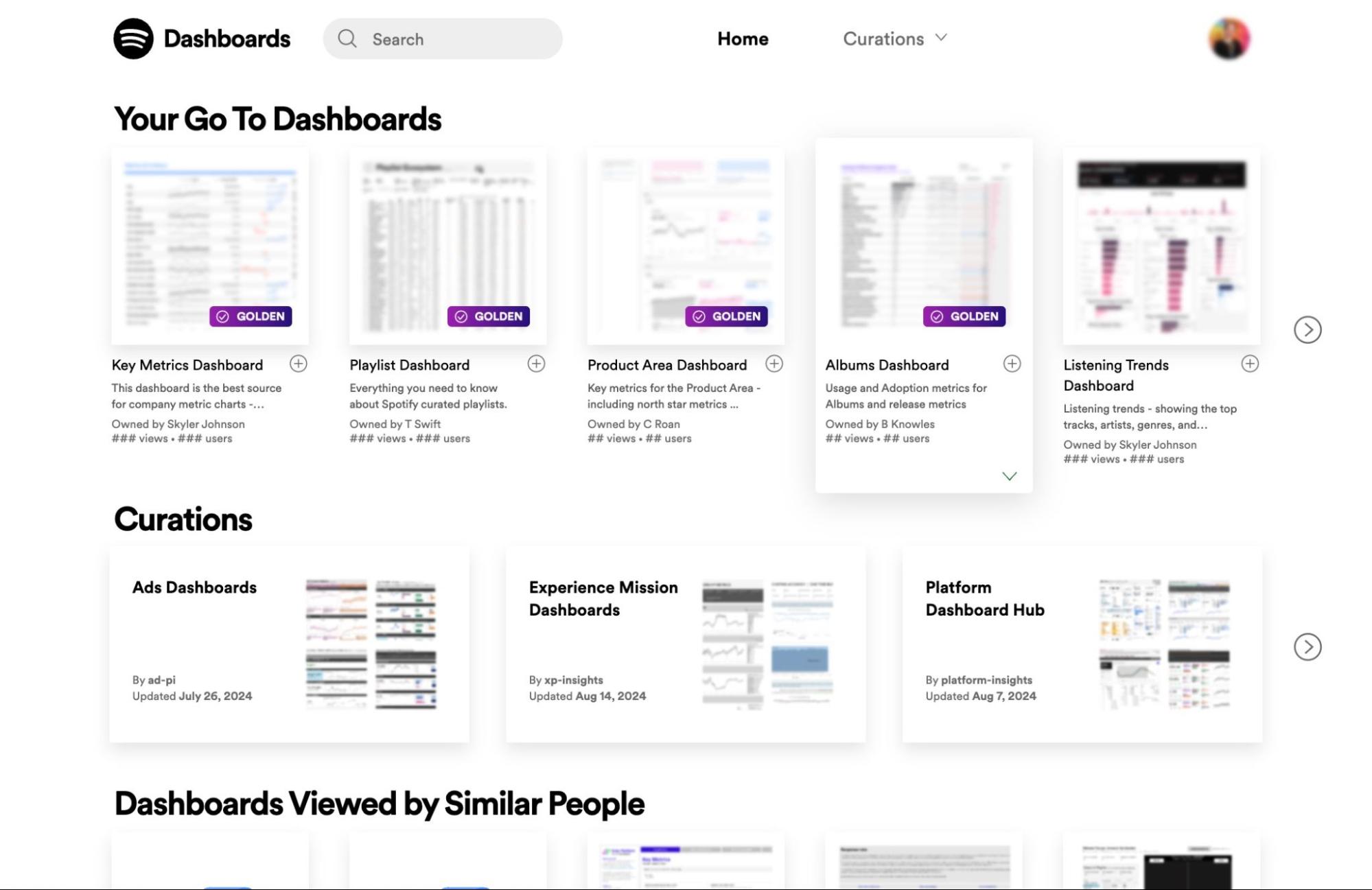
To provide easy access for dashboard consumers, we developed the Dashboard Portal. Dashboard Portal is an internal site consisting of a searchable catalog of all published dashboards at Spotify, both from Tableau and Looker Studio. It includes ways to organize and curate groups of dashboards and adds extra context to dashboards for viewers.
The primary features of Dashboard Portal include:
- Search: Users can search by title, description, and field names to find existing dashboards. No more “Do we have a dashboard about X?”!
- Curation: Dashboard authors can create curated collections of dashboards that become a go-to hub for their teams. Think “The Ads Dashboard Hub,” containing all the dashboards the team believe are important for their stakeholders to be aware of.
- Trust and Quality: The Dashboard Quality Framework labels are displayed as a badge on top of the dashboard thumbnails and on all dashboard pages, giving viewers a quick understanding of a dashboard’s quality, and more importantly, whether they can confidently trust it. We’re able to spotlight and draw attention to our Golden dashboards — our cream of the crop! In doing this, we’ve seen that users are more likely to view dashboards with a Golden label.
- Ubiquity: While Tableau and Looker Studio each have their own discovery mechanisms, we’ve found that having a Dashboard Portal that surfaces content from multiple tools enables the user to not have to think about where the dashboard lives, but rather just find it.
- Enhanced Context: Dashboards are embedded directly into the Portal and boosted with extra context: dashboard owner, last data refresh date, usage stats, and underlying SQL queries.
Our robust approach to dashboard creation and management showcases our commitment to data democratization and informed decision-making across the company. Our sophisticated tools and frameworks ensure that every dashboard is not only visually appealing but also a well-oiled machine delivering actionable insights.
Special thanks to Jacob Olsufka, Arielle Silverman, Pavlina Mitsou, Daniel Wolmerud, Alex Pavlov, Axel Örnefalk, Robert Hjortsmarker, and Abhishek Upadhyay.
Tags: Data, engineering culture

